Identity
GLiTCH is an association that was started with the idea of bringing people together to have fun and learn together. A safe place for all to feel part of a family, when far away from family.
Bold but Fair
We’re not a typical association, we’re an association that dares to do what the ordinary fear. But we’re also fair and kind with what we do and who we work with.
Honest and Trustworthy
We’re true to ourselves and to others, never looking to be something we’re not but always striving to be a trusty friend you can count on.
Fun Simplicity
We’re professionally fun with our work, always keeping things simple so others can have fun too.
Diverse Inspiration
We’re a community full of different minds, ideals, thinking and values. We strive to be an inspiration to all to embrace diversity and change/improvement.
Constant Improvement
We’re always learning from our mistakes, moving forward and ensuring we do better is what we strive to achieve together.
(ɡlɪtʃ) or (guh-lit-sh), not (ggg-litch)
Naming Usage
Origin
Our name is inspired by the multiple times we’ve all encountered glitches in games that create an unexpected funny/fun/positive experience. Our name represents those moments, but in real life, where we bring an unexpected positive twist to anyone’s experience in life.
Pronounciation & Usage
GLiTCH should always be typed with capitalizations except for the i. That’s because the i is what separates us from the rest, and shows the “GLiTCH” in our logo.
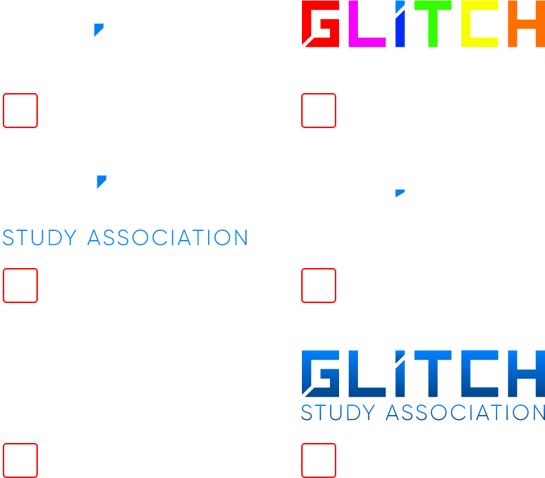
Logo
Looking to use our logo? Awesome! To make sure the logo and your design looks as best as it can with it, please follow these rules and guidelines.
Do's
- Give the logo space to breathe
- Show the logo in black or white (with its accent color)
Don'ts
- Alter, rotate, or modify the logo
- Obstruct the logo
- Accessorize the logo
- Anthropomorphize the logo
- Alter the subtitle
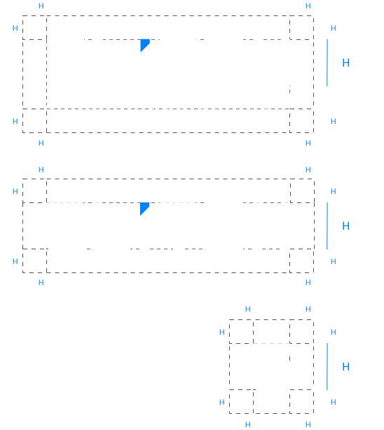
Sizing
Size matters when it comes to logos. Make sure to use these guides to help you decide which size is best.
If you’re not sure that the size is correct, try a test print when possible on paper.
Spacing
Spacing is important with our logo. Using too many elements around the logo will only drown the logo and make smaller details such as the slice dissappear.
Poor Usage
We know some like to be very creative, and we love that! But don’t make the same mistakes we’ve made as shown here.
If you have any doubts, please contact us about the use, before printing or publishing.
Colo(u)rs
The association is using dark colors for background due to the fact that most members are gamers who enjoy playing until late at night. This is why we’re striving to make our designs to be less straining on their eyes.
The black color is mainly used for backgrounds, while the white is more for typography or artwork. The blue that we use is strictly used as an accent color. Too much of this color in a page or design can be overwhelming.
Please use the appropriate scheme for the appropriate media (RGB: Digital Medias, CMYK: Printed Medias, Web: Website Only).
Click on the blocks to copy their color.
H1
64px
Heading One
H2
56px
Heading Two
H3
48px
Heading Three
H4
40px
Heading Four
H5
32px
Heading Five
H6
24px
Heading Six
P
16px
Paragraph
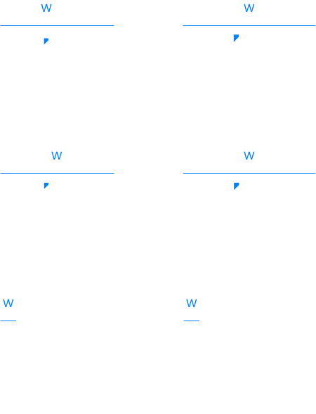
Font Sizes
The base font starts at 16px (min. 13px) and is added by 8px for every heading level.
Font Colo(u)rs
Font colors are based on the brand colors that are established in the Color Section. Due to readability and contrast, certain cases where a lot of text is to be read, we use the alternative colors to be easier to read.
The accent color blue is only meant to be used to attract attention to spots, not for heading/title usage.
H6
24px
Context
H2
56px
Idea
H3
48px
Title
P
16px
Paragraph
Normal Text
Emphasized Text
Linked Text
Font Usage
We use font weights to help emphasize or bring attention to certain areas. Our most common technique is to use bold to emphasize the general idea (for quick reading) and regular/light to give context to the idea (for detailed readers).
Example of use:
Lorem ipsum dolor sit amet, consectetur adipiscing elit. Aenean aliquet lectus eget sem gravida, in consectetur ex ultrices. Fusce molestie odio odio, quis cursus arcu posuere bibendum. Donec ornare tincidunt velit at eleifend. Quisque orci est, commodo vitae porttitor non, iaculis eget odio. Fusce aliquet semper diam. Sed eget vehicula tortor. Quisque rhoncus lacus eget luctus vulputate. Phasellus ornare ac lacus a gravida.
Thank You!
Questions?
If you have questions regarding the branding guidelines and how to apply them to your design, feel free to reach out to us!
Artworks
Every artwork that is used by GLiTCH is graciously donated/given by students/members/committee members or hired designers. All materials used, are authorized to be used only for GLiTCH Design purposes.